As the title suggests Things 0.9.2 not only brings iCal sync but more generally support for Leopards system-wide to-dos. What is the difference?
With Mac OS X 10.5, the database that stores the user's calendar data was integrated into the system. Developers got a whole new API that is simple and fun to work with. More importantly though, changes that are made through this new API propagate practically instantly through the system. To-dos will show up in iCal, Mail or any other participating application the very moment you press the enter key in Things.
On previous systems, syncing to-dos between applications was a complicated process that sometimes even had to be triggered manually. Since we wanted to provide the best experience for our users, and most of them are on Leopard anyway, it was clear that we wanted to use Leopards to-do service instead of the older slow sync. Unfortunately the new and older APIs cannot be used at the same time. Providing backwards compatibility with Tiger is a whole new development effort, which we might attempt later along with .Mac sync.
Getting Started
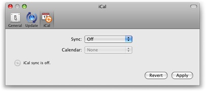
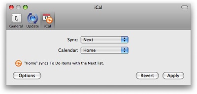
You turn on iCal sync from Things' preferences:
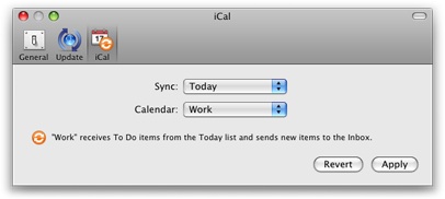
In addition to what you might recall from our previous post, we have now included an Options button. It opens a sheet (see below) where you can customize whether tasks show their associated project and tags in other applications.
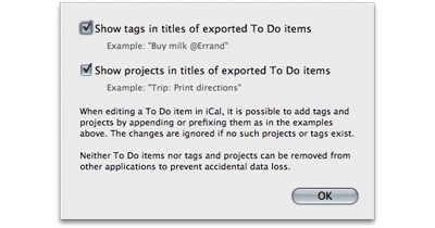
These options are turned on by default. You can also add tags and projects from iCal or other applications. For example, adding "@Home" to the title of a to-do in iCal instructs Things to add the tag "Home" to it. There is no need to worry that this feature is triggered by accident, since only existing tags are used. You can safely enter email addresses for example. These won't be recognized as tags and don't trigger the creation of new tags in Things. The same goes for projects. Only existing projects are recognized and no action is taken if multiple projects with the same title exist in Things. Things is also smart enough to ignore projects that are already logged or in the trash.
We have carefully taken precautions to prevent you from shooting yourself in the foot :). It is not possible to delete to-dos from Things by deleting them in other applications. Since we have no control over applications that integrate with system-wide to-dos, we cannot prevent situations where a large number of to-dos might be accidentally deleted by badly written third party apps.
It is also not possible to delete tags, or projects from other applications. It is just too easy to accidentally type over a title deleting all meta data that might be there. And to-dos removed from their project or missing their tags might be very difficult to find. The iCal sync feature has been designed with the assumption that Things is the primary to-do manager and that other applications, like Mail or iCal, are mostly used to conveniently retrieve stuff or enter new items.
Complete Control
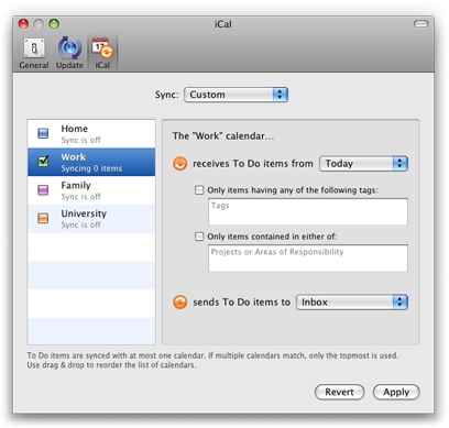
If you want complete control over the syncing process, choose "Custom" from the Sync menu. The dialog transforms into advanced mode allowing you to associate different lists (foci), tags, projects, and areas of responsibility with each calendar.
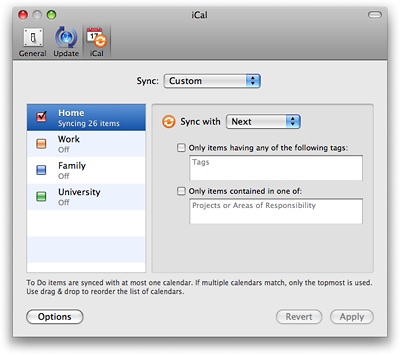
You do not need to worry whether the list of to-dos you sync with each calendar overlap. If they do, Things will simply sync with the first calendar in the list that matches. Of course, you can reorder the list of calendars in Things.
The criteria you associate with each calendar work both ways when it makes sense. For example, if you specify the "Errand" tag for a certain calendar, then only items having the "Errand" tag are synced with this calendar. If on the other hand you enter a new item in iCal, this item will automatically get the "Errand" tag in Things. The latter, however, only works with a single tag. If you specified multiple tags, there is no way to find out which one you would like to be added in Things. The same is true for projects and areas of responsibility.
Usage Scenarios
Here are some usage scenarios that might not be completely obvious:
- When you create a to-do in Mail using a selection of an email message, the URL for this message is added to the notes section of the corresponding item in Things. Clicking on it will open the associated email message in Mail. Please note that due to a bug in Apple Mail, it will only honor the deletion of to-dos when running. Superfluous to-dos need to be manually removed from Mail.
- You can also use iCal subscriptions. Let's assume you subscribed to the calendar of your significant other. Just activate this calendar in Things for the Next list for example. (You also need to make sure, that syncing to-dos is activated for the subscribed calendar both in your as well as your spouses calendar.) Your spouse can now send you to-dos, by simply adding them to the corresponding calendar. Note however that subscriptions are read only. There is no way for you to change such a to-do in iCal. Not even by checking it off. No matter what you do in Things that would normally cause the item to change calendars, or be entirely removed from iCal, will have no effect.
- You can use applications like Anxiety to create a HUD style Today list that is always visible.
Chris did a great job in testing the new iCal sync feature. But with a feature like this, that can be used in so many different ways, it is quite likely that it is not yet void of bugs. Hope for the best, but expect the worst :).