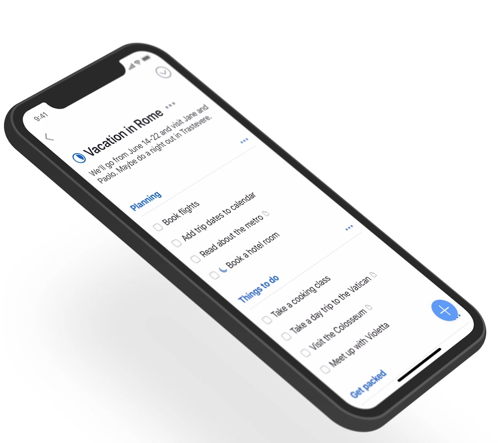
The iPhone X is here and Things looks great on it.

When we designed Things 3 we got rid of as much of the app’s ornamentation as possible. As a result, the app is already perfectly suited for the iPhone X’s new edge-to-edge display – we only had to make a few small adjustments, which are available now in Things 3.2.4.
One of the changes we made for Things 3 actually turned out to be quite splendid for the iPhone X: the removal of the row of buttons along the bottom of the screen. Because this is gone, your to-dos now flow all the way down to the bottom of the device. It kind of looks like you’re holding a piece of paper (which is what we designed Things 3 to look like) and it feels really great in your hand. We think you’re going to love Things on iPhone X.
By the way, we’ve also released 3.2.4 for iPad, which adds some basic shortcuts for external keyboards. We hope you enjoy these updates!