The major new feature of our just-released versions of Things for iOS - Things for iPhone 1.7 and Things for iPad 1.4 - is the ability to create and edit repeating tasks directly on iOS devices. They can also be synced to the Mac version, which is enabled by the new update of Things for Mac.
Designing an interface for repeating tasks is a challenging task for any platform, let alone for small iOS devices. In this blog post I want to give you an overview of our design goals and the solution we came up with.
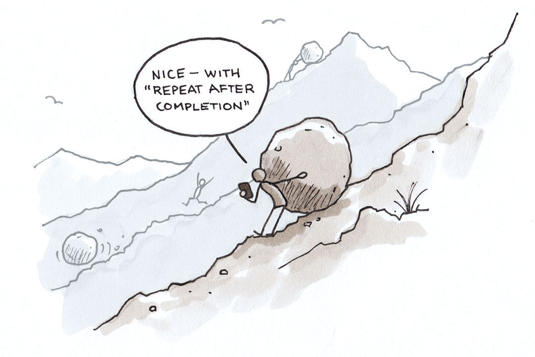
Those of you who have been following the development of Things for Mac since it was in beta might remember the challenges we have faced in coming up with a good UI for repeating tasks for the Mac. We wanted to have a powerful and flexible implementation that was still easy to use. After an extensive design journey with many iterations, we were very happy and proud of the outcome. Two years later, and after lots of customer feedback, we see that we did most things right. As always, there is room for improvement – but that’s another chapter.
When we started designing repeating tasks for iOS, we asked ourselves if it was possible to bring the same expressive power to iOS, while still keeping the UI clean and easy to use. Given the constraints of a small device like the iPhone, we knew that this was not going to be easy.
These were our goals when designing the repeating task UI:
-
Expressiveness
Repeating tasks come in many different varieties and complexities. If you look at a list of typical repeating tasks people have, you will soon realize that there is no single prototype recurrence pattern they can all be mapped to. Examples are: "pay rent at the end of each month", "make backups every 2 weeks", "for the next 5 months, create a performance report at the beginning of the month", "perform health exercises every Monday and Thursday", "prepare for Macworld Expo every January 1st", "prepare club meeting every second Sunday of the month". A repeating tasks implementation that only has the expressive power to specify a subset of the tasks above arbitrarily constrains the user in the tasks he can manage efficiently. -
Discoverability
The UI should make it obvious to the user what kind of recurrence patterns can be specified. Expressiveness is of little use when users need to read extensive documentation of how to properly enter certain recurrence patterns. -
Ease of use
This goal is obvious, but what exactly does "easy to use" mean in the context of repeating tasks? For regular task entry, one very important aspect of "easy to use" is that entering a new task requires very few taps. As something that is done over and over each day, any extra taps quickly turn into an annoyance for the user. This is why our quick entry is designed to keep the number of taps to a minimum. The same does not equally apply to repeating tasks. Typically, repeating tasks are entered much less frequently. Some are even entered once when you start using the app and remain there for years ("pay rent" is one such example). So rather than speed of entry, it is much more important that the UI has a great clarity and conciseness when it comes to specifying the different recurrence patterns.
With these goals as our guides, we evaluated existing implementations, sketched out different designs, discussed the merits and disadvantages of each, and finally arrived at the version we've now shipped. We believe it is the best and most elegant repeating tasks implementation currently available on iOS. Let me walk you through it.
Just like on the Mac version, repeating tasks can be created from within the Scheduled list. For that, we have a new button in the toolbar.

Note how there is one specific place in the UI to go to when you want to create a new repeating task. The existing UI for adding regular tasks is left untouched, so adding this feature didn't complicate other parts of the application. This is very much in line with the observation that repeating tasks are not entered frequently.
When you tap the button, a new modal view comes up that is specifically designed for repeating tasks.
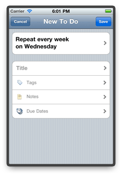
At the very top, we show an English sentence that describes the current recurrence rule. Below, you can enter the title, tags, and notes of the repeating task, and also specify whether it should create instances with due dates.
Note that we pre-populate the recurrence rule based on the current day of the week. In most cases, the rule you want to specify probably differs from the one we show by default. But then why do we show a default rule in the first place?
We believe that it communicates two things very nicely. First, we can present a view that already contains all the elements of a repeating task: the recurrence rule, together with the title, notes, tags, and due date. So immediately, you know what you are expected to fill out before you can save the task. Secondly, if you don't like the recurrence rule, you will immediately know that you need to tap the description text in order to change it. And what's really great about this, even before you see the next UI view with the different controls that let you specify a different rule, you already know what the end result of those settings will be: a new English sentence that accurately describes the rule you had in mind.
This is the view that appears when you tap the recurrence rule description:
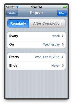
When looking at the general layout of this view, you will realize that – when read from top to bottom – this is basically the same English sentence you saw before, except it is now divided into different controls that let you specify the different parts of the recurrence rule to suit your needs.
Let's now change this rule to "Every 2 months on the first and third Sunday". First, "Every week" is obviously wrong, so we tap on that. A new view slides in, letting us specify the "Every 2 months" part.
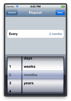
After we're done with that, we go back to the screen before, and tap on the "On" section. In the view that comes up, we select the 1st Sunday, tap on "Add More", and also select the 3rd Sunday.
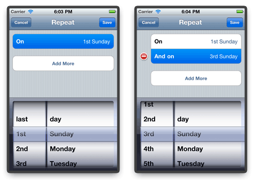
Note that we can additionally specify when the recurrence should begin, and when it should end (e.g. after 5 recurrences, or on a specific date), but we won't do that for now. Tapping "Save" brings us back to the original screen where the English sentence now properly describes our new recurrence rule.
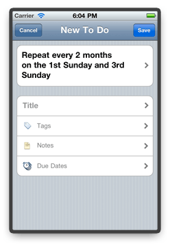
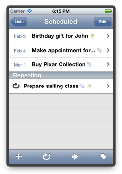
After we enter the additional repeating task properties and tap “Save”, the new task shows up inside the Scheduled list.
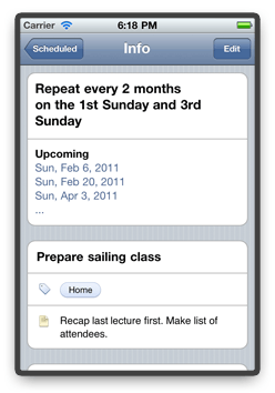
If you later revisit the repeating task, you will conveniently see upcoming recurrences:
This wraps up the walkthrough of the repeating tasks feature. I hope you got a good first impression, but you should definitely try them out on your device to get a complete picture. There are additional details not covered in this example:
- If you specify weekly recurrences, we have an optimized picker that lets you easily select multiple weekdays.
- You can also create tasks that repeat after the completion of the previous one.
- You can specify the number of times a repetition should occur.
- You can pause and resume repeating tasks (very useful, if you're going on vacation).
- If you use Areas, you can assign new repeating tasks directly when you create them.
We hope you enjoy using repeating tasks on iOS. Feedback is, as always, greatly welcome.