We have just finished the user interface of our new iCal sync feature (or more precisely, support for Leopard’s system wide to-dos) and would like to share some screenshots.
The screenshots are taken from a private development version. But before moving to the screenshots let us give you an idea of what it is like to implement a new feature.
Here is a list of steps we usually take when tackling a major new feature. We ...
- Evaluate all related feature requests.
- Decide what will actually go into the new feature. This is a quite complicated step. We try to look at common usage scenarios. We also try to guess what the majority of users would need. Sometimes we postpone features because their implementation would take too long. An example is providing foldable pocket layouts for printing. We’d love to have it, but it didn’t feel right to make everyone wait longer than necessary before a fundamental feature like printing even shows up.
- Try to find a unified point of view if the results of step 2 are too varying or divergent.
- Try to think of ways how we could clearly communicate the ideas of 3.
- Create Photoshop mock-ups of the user interface.
- Start with the actual implementation of the interface and test it. If necessary, go back any number of steps and start all over again.
- Create the engine or logic that makes the feature work.
- Test-drive a functional implementation of the new feature for the first time. Go back any number of steps if necessary and start all over again.
- Extensive bug testing and fixing.
- Seed the new version and watch for related emails and forum posts. Fix bugs and make notes for future improvements.
With iCal sync we are now ready to move to step 7.
We had two requirements for iCal sync. On one hand, turning it on should be as simple as turning a switch. On the other hand, we wanted to take advantage of the existence of multiple calendars and make it flexible enough for usage with mobile devices and apps like Anxiety or Apple Mail. This requires that users are able to restrict syncing to different parts of Things like Focus lists, to-dos that have certain tags, Areas of Responsibility, or even projects. Obviously having both simplicity and flexibility seems contradictory. Here is how we are doing it.
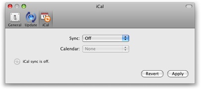
When you select iCal in Things’ preferences for the first time you will see the simple variant of the dialog.

There you have it: the On/Off switch. Well, it is actually a menu and looks like this:

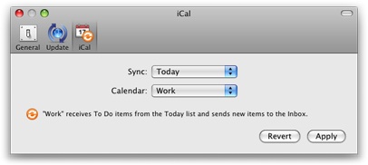
The most common requirement is to be able to export either all active to-dos (Next) or the currently pending items for today (Today), and to be able to import new to-dos created in other applications. When selecting either "Today" or "Next" from the sync menu this is exactly what you get.

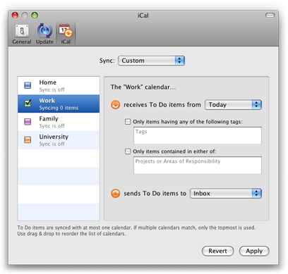
If you need the full power of the underlying engine then choose “Custom” to transform the simple variant of the dialog into the advanced one:

The text fields offer auto completion and only accept valid input. It is possible to drag tags, projects, or areas to these fields.
We believe that the advanced variant of the dialog puts an amount of flexibility at your fingertips that compares rather favorably with the competition. However, there are still more feature requests related to iCal which didn’t make it into this version. But never worry, Things will continue to be improved at full speed well beyond the 1.0 release.
If you would like to comment, instead of sending us email, consider to use the comments section of this article or even better the forums. Your feedback will be much more valuable if your fellow users are able to read it too and respond to it.