Things

Things is the award-winning personal task manager that helps you plan your day, manage your projects, and make real progress toward your goals.
Watch Introduction Video

 Simply Powerful
Things makes it easy. Within the hour, you’ll have everything off your mind and neatly organized – from routine tasks to your biggest life goals – and you can start focusing on what matters today.

 Get Things, Get Done
Whatever it is you want to accomplish in life, Things can help you get there. Install the app today and see what you can do!


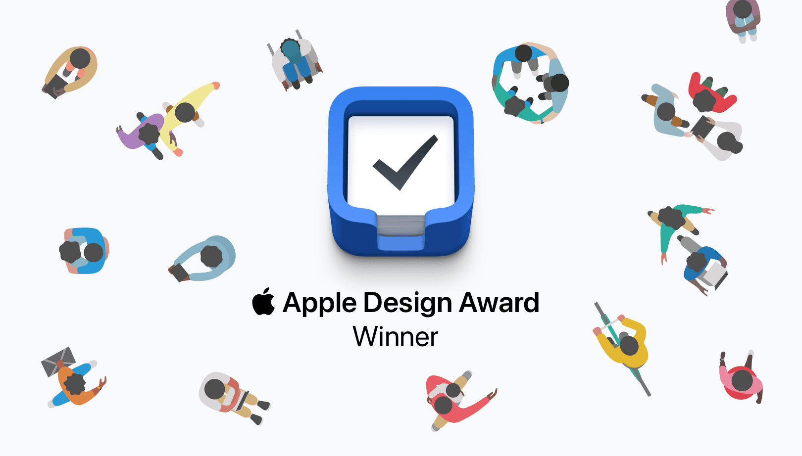
 Read All About It
Honored twice with the prestigious Apple Design Award, Things has won over critics with its unique blend of powerful functionality and ease-of-use. Here’s what they have to say.
“A joy to use and beautiful to look at, Things 3 has been completely re-imagined to improve efficiency. Its thoughtful design and powerful features help you get organized and make the most out of every day. [...] Things 3 sets the standard for how apps should be designed and developed to be their best on every device.”Apple Design Award Winner
“Things 3 is the best task management app out there. It is simple and easy to use, and it has a beautiful design. While being powerful enough for even the most detailed and organized power user, it is also simple enough for the rest of us.”
“Things 3 offers the best combination of design and functionality of any app we tested, with nearly all the features of other power user applications and a delightful interface that never gets in the way of your work.”
“Things never feels messy or overbearing, no matter the length of your task list. Lovely, unfolding animations keep your place, and there’s a super-fast search tool if you get lost. It’s the rare to-do list app that doesn’t try to force you into a particular way of thinking. […] It’s more like a clean, crisp piece of paper, ready whenever you need it.”David Pierce
“There are plenty of reasons to love Things, such as its elegant design, excellent collection of keyboard shortcuts, fast sync, and support for Markdown notes in projects and tasks. However, the app’s native support for Shortcuts is something special.”
Best New FeatureFederico Viticci
“Things has always been a top-notch task manager app, but this iteration is its absolute best. The developers of Things have finally found the perfect balance of easy use and robust features. [...] I'm loving it, and I think you will too.”Lory Gil
“Things 3 has an amazing design and aesthetic, and a ton of powerful new features that tie it all together. It’s hard for me to resist when something looks this good yet still functions properly.”
“You would be hard-pressed to find a better looking to-do app than Things. The first time I opened it on my iPad, I couldn’t help but pause a few moments to admire it. [...] It’s simple, but beautiful in its simplicity. Screenshots don’t quite do it the justice it deserves.”
“One quick glance at the new UI is all it takes to fall in love with it. The design team at Cultured Code have worked their magic all over the app, and every individual bit and pixel has been redesigned and crafted to perfection.”
“While the app immediately clicked, and was at once dead simple to get started in, it’s taken me quite a while to realize what actually makes it so good. It was simply designed with the understanding that real people are going to be using it for real life. What an amazing piece of software.”
“[…] let’s end with an example of a piece of iOS software that is pure craft: Things. Things on iPad and iPhone is one of the most tactile, fast-as-you-can-move apps around. Each animation is purposeful. Mainly, it is fun. It’s a fun app to be in. To put stuff into, to rearrange. It is old. Things has been around for over ten years. I was glad to open it ten years ago, and I am glad to open it today.”
“Everyone needs a task manager—and Things is adaptable enough for anyone. It’s crisp and lightweight, featuring a simple but effective interface. […] It’s like the unicorn of productivity tools: deep enough for serious work, surprisingly easy to use, and gorgeous enough to enjoy staring at.”App Store Editors’ Choice
“For pushing the iPad down a path untraveled by other apps, and making us dream of an iOS experience that’s fully keyboard-optimized, Things 3.6 is the MacStories Selects “Best App Update” of 2018.”
Best App Update
 Things Newsletter
Subscribe to our newsletter to stay up-to-date on Things’ latest news. We only send it out a few times per year when we have something interesting to tell you.